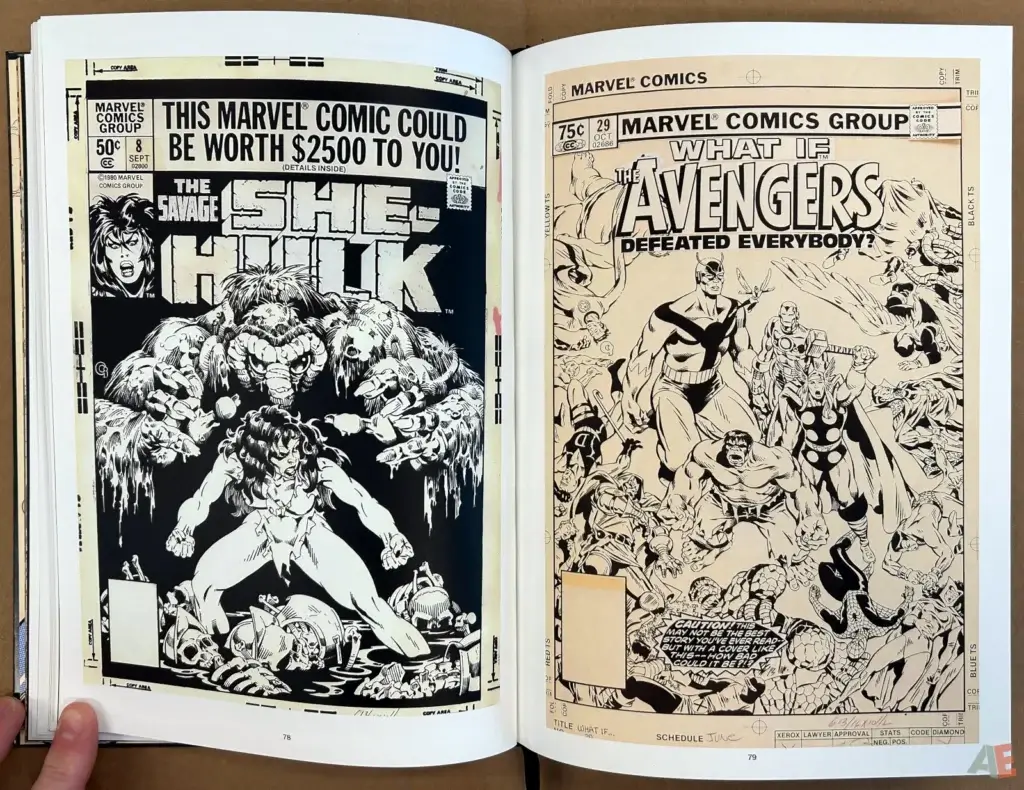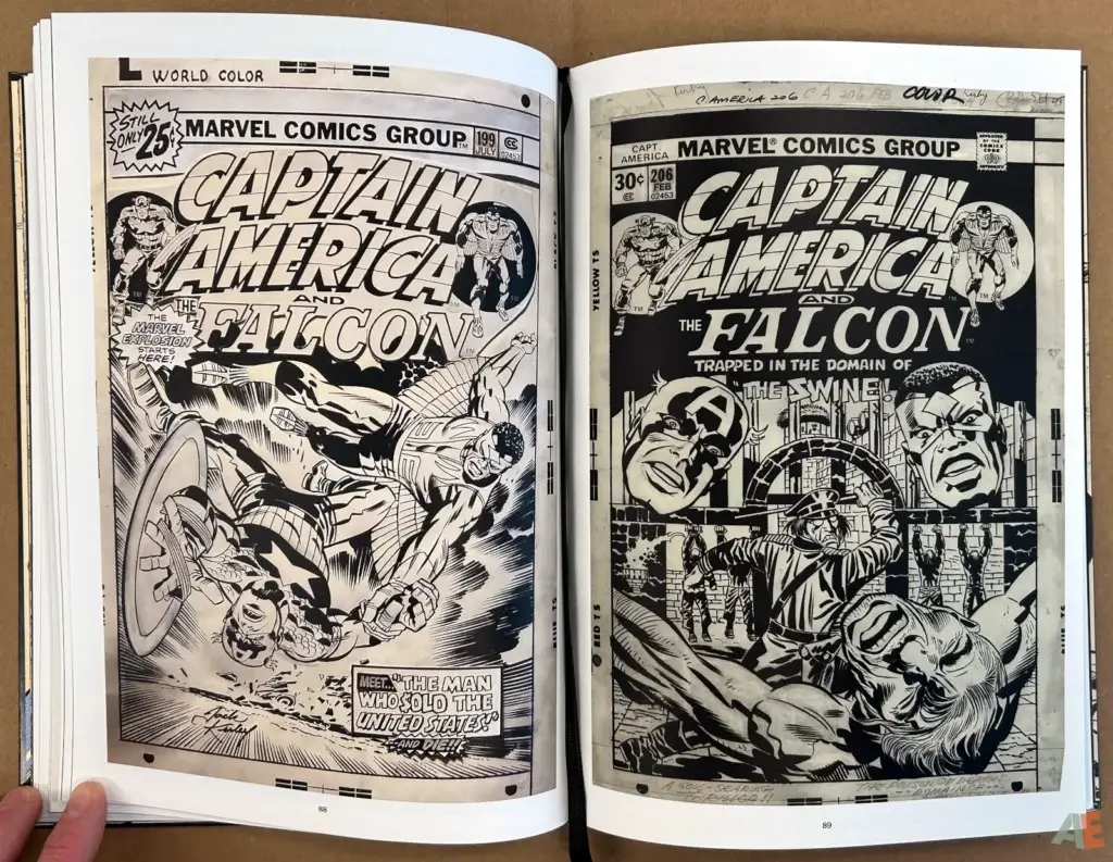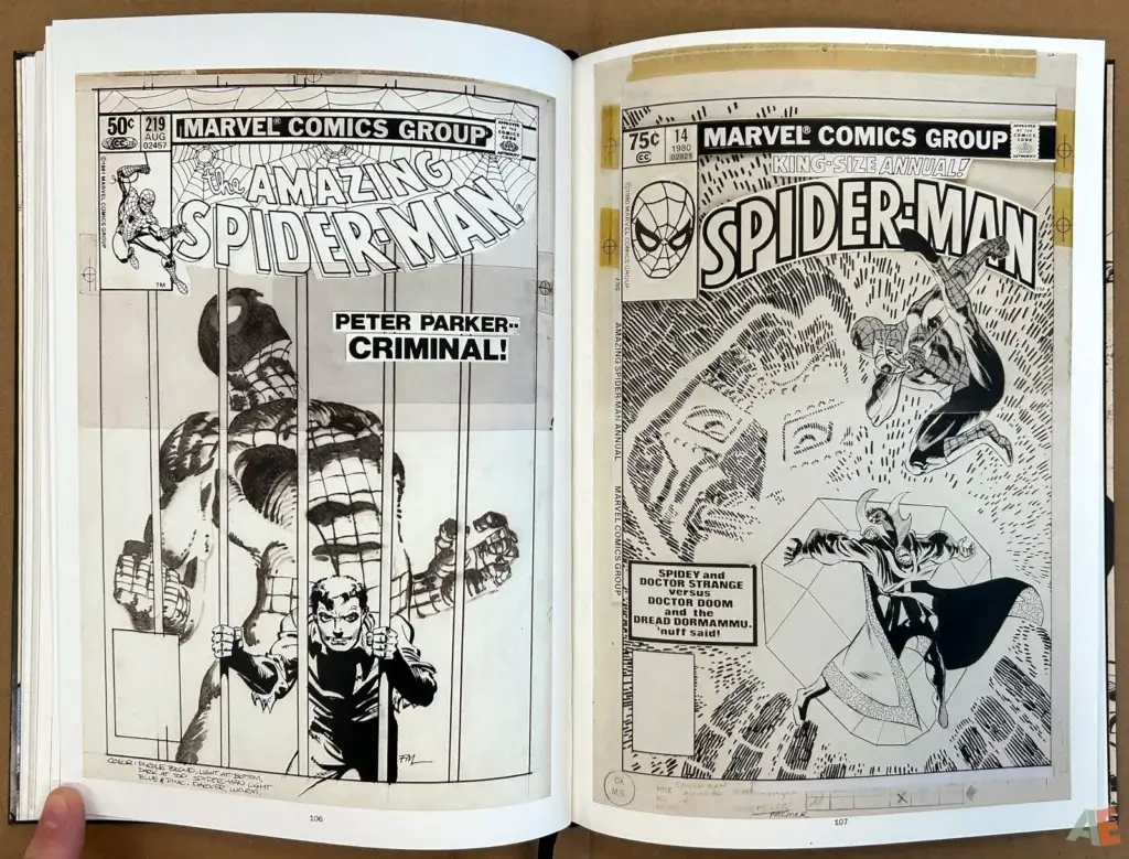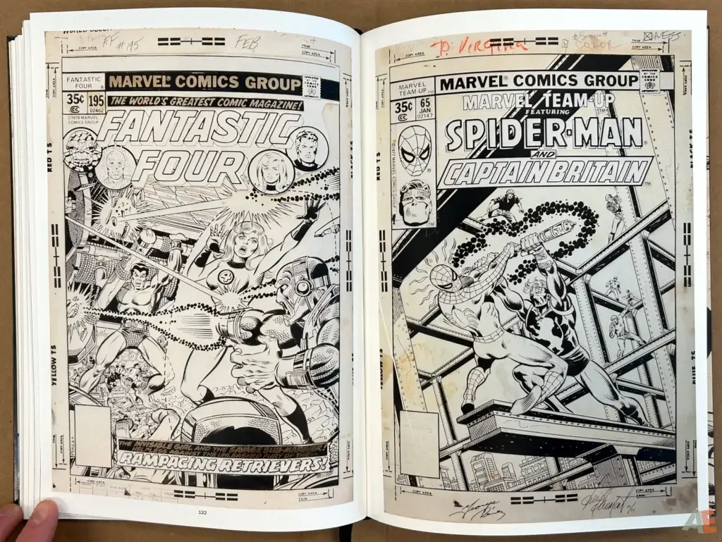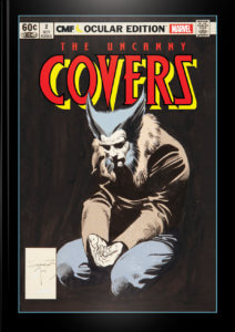
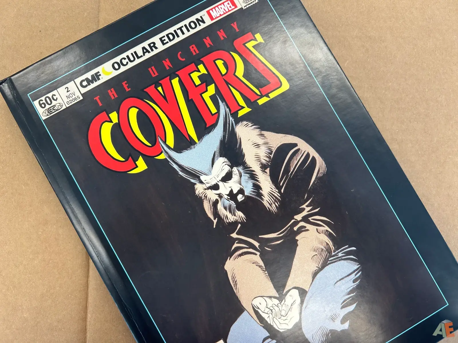
(Ian Chalgren) I’m pleased to present my second Ocular Edition book. Over 200 pages of original Marvel comic art from the ’60s, ’70s, and ’80s. This book comes in five variant cover editions. 10 copies of each edition were printed, so 50 books total.
The purpose of this book is to land book design projects with publishers like Abrams, DC, Dark Horse, Fantagraphics, IDW, Image Comics, Marvel, PS ArtBooks, Taschen, etc. This endeavor has proven successful thanks to Ed and Jim at Cartoonist Kayfabe dedicating an episode of their show on this book. Watch the video below.
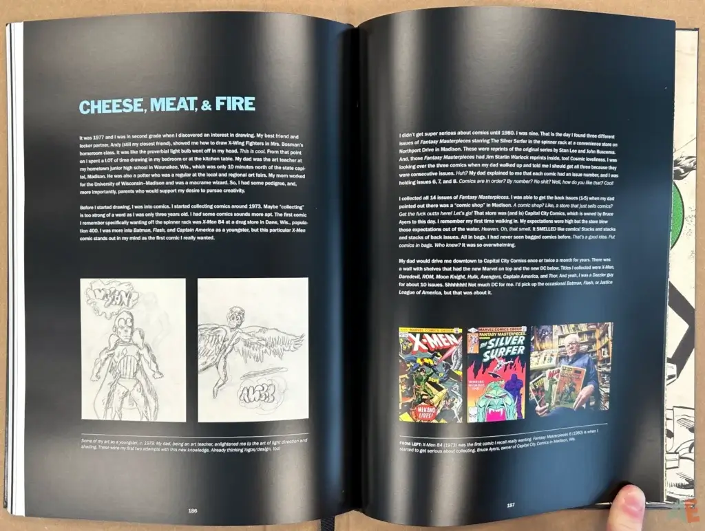
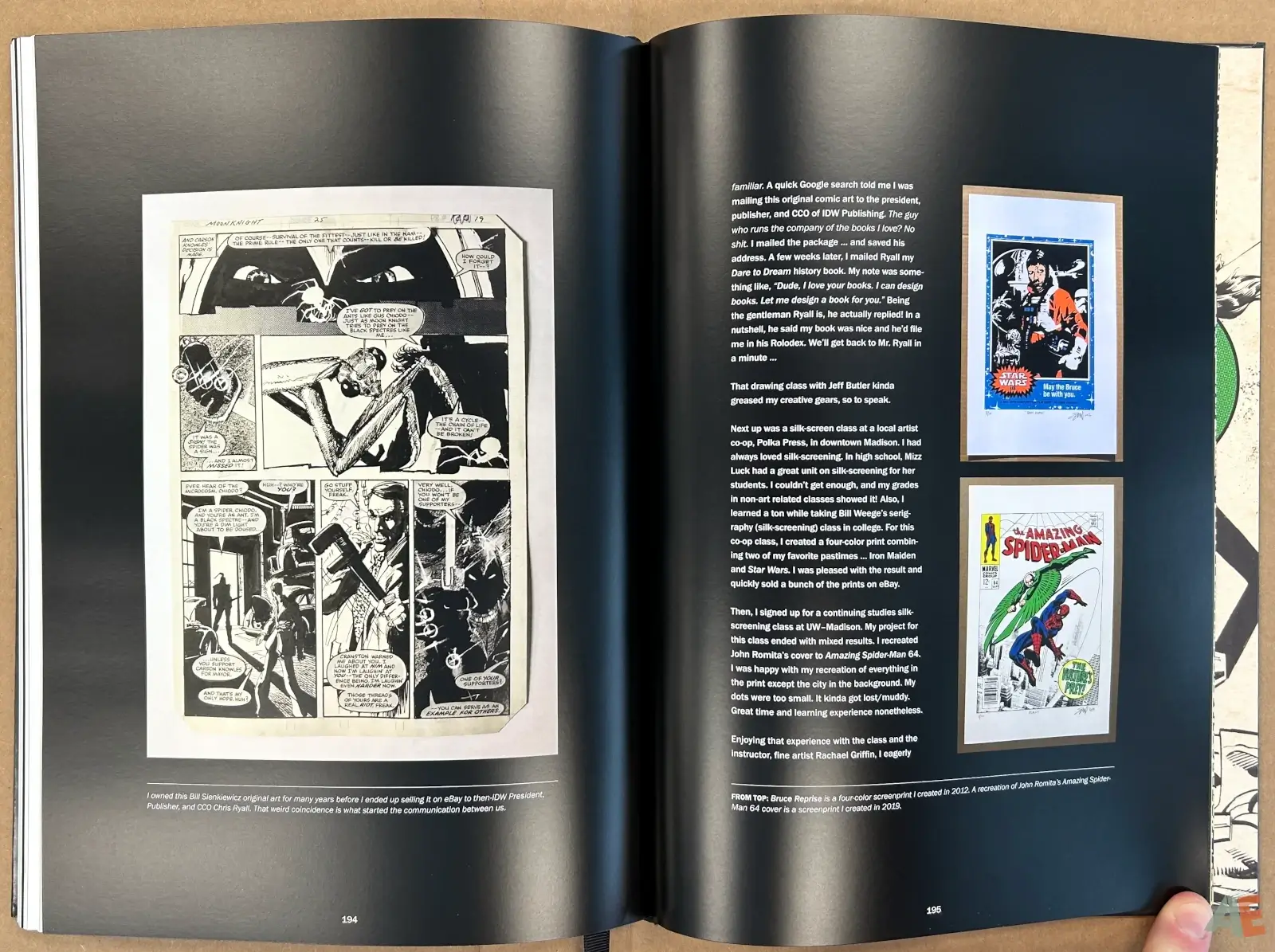
At the end of the book is a 20-page bio/journey/resume of yours truly (Ian Chalgren).
You can download a high-resolution PDF of the entire book (and other books designed by me) at this link.
These books are not for sale. All imagery within is ©Marvel.
- CMF Publishing, June 2023
- 211 Pages, 8.75″ x 12.5″, hardcover
- Not for resale
As with all AE format material (Artist’s Editions, Artifact Editions, Gallery Editions, Art Editions, Studio Editions, etc.), this is a collection of classic comic material and I’ll be reviewing the book and not the story. For a complete list of all current and announced editions, with review links, please visit our Index. Also, see What is an Artist’s Edition and our Artist Index. This site contains affiliate links for which I may be compensated.
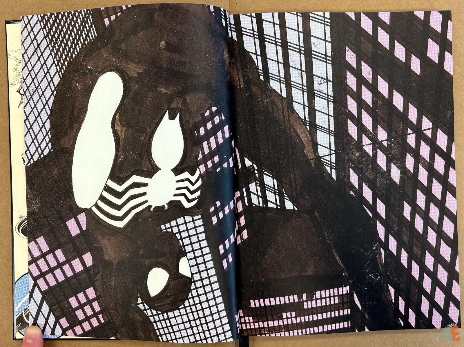
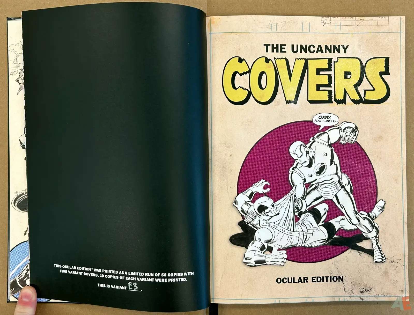
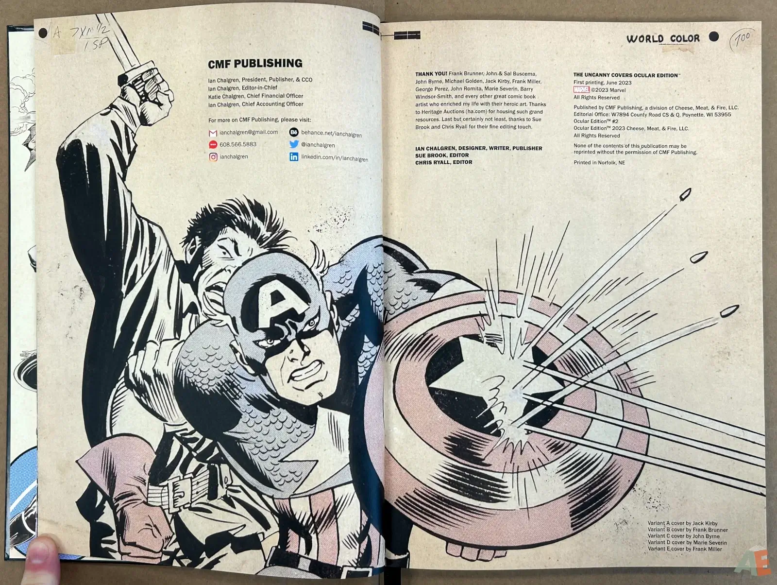
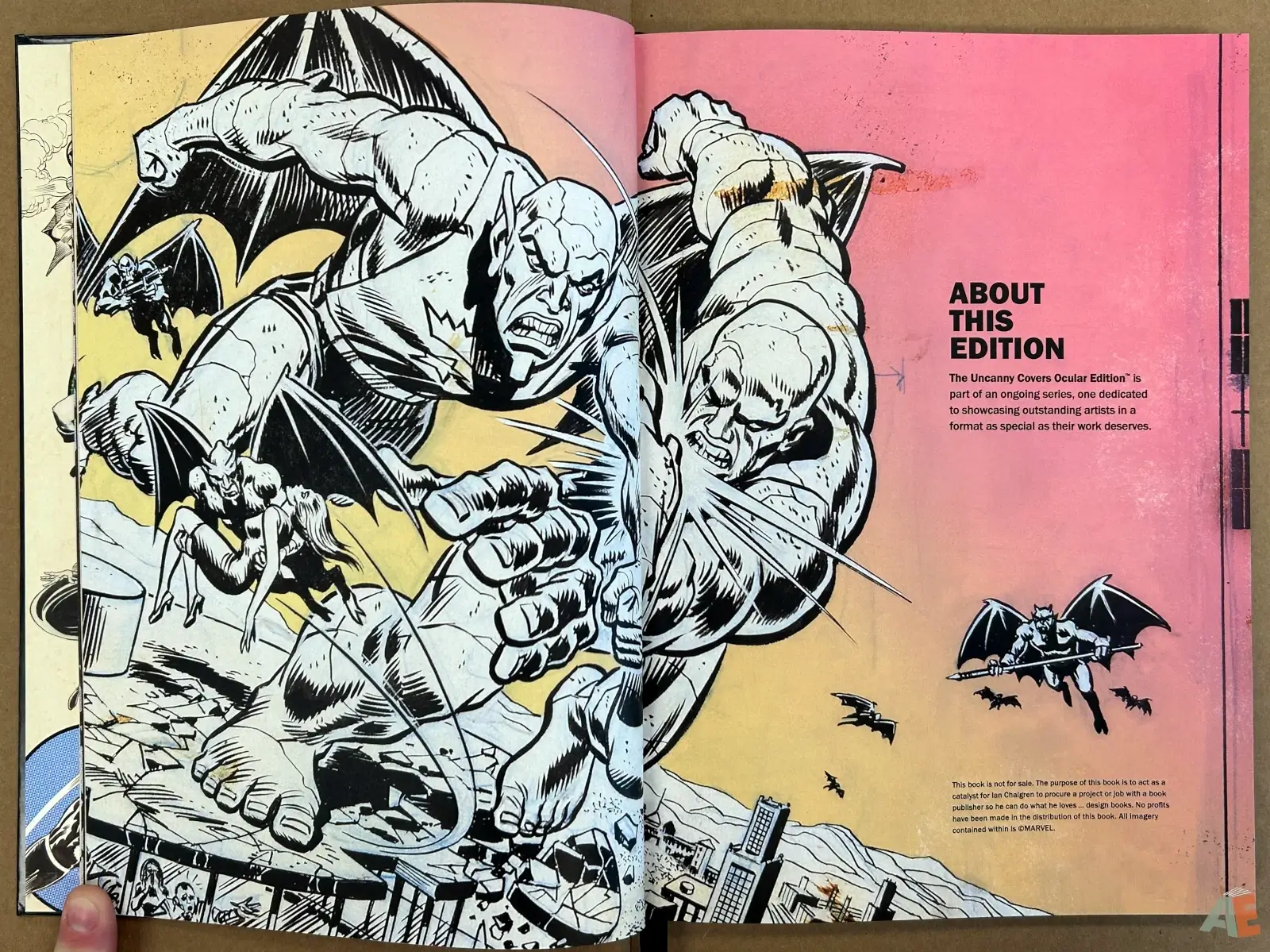
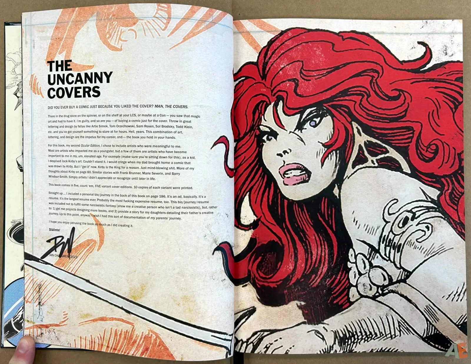
This is not your typical review, as this is not your typical AE format book. Here is Ian with the first and last words of the book, summing up its purpose.
Straight up … I included a personal bio/journey in the back of this book on page 186. It’s an ad, basically. It’s a resume. It’s the longest resume ever. Probably the most f**king expensive resume, too. This bio/journey/resume was included not to fulfill some narcissistic fantasy (show me a creative person who isn’t a tad narcissistic), but, rather to: 1) get me projects designing more books, and 2) provide a story for my daughters detailing their father’s creative
journey. Up to this point, anyway. I wish I had this sort of documentation of my parents’ journey.
I cannot overstate this — NO profit has been made from this limited edition set of books. A hell of a lot of money (and time) was spent producing it though. Instead of suing me, hire me.
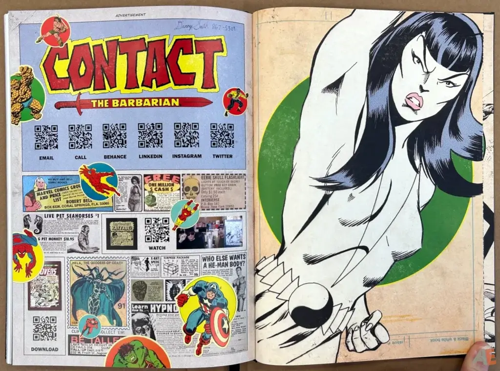
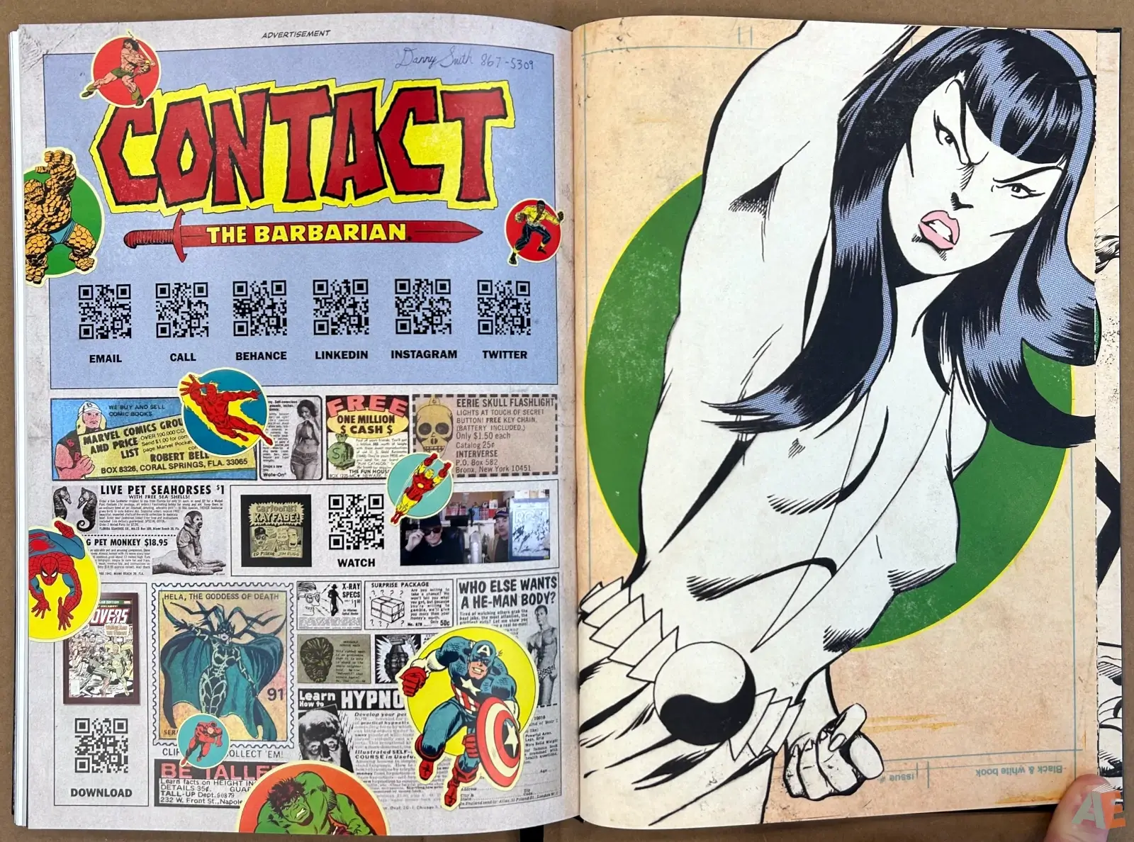
Just like my first Ocular Edition, Sal Buscema’s Spaceknights and Superheroes, which featured Buscema’s work on ROM and other Marvel titles, this book is intended to be the catalyst for me to get some projects doing what I love … designing books. I’m looking for special projects with empowering partners who value my input on the entire project, not just the design. All kinds of contact info on the next page. If you’re digging what you see/read in this book, gimme a holler, and let’s make something uncanny together.
With that as our lens, let’s look at this as a personal AE format passion project and see what can be accomplished.
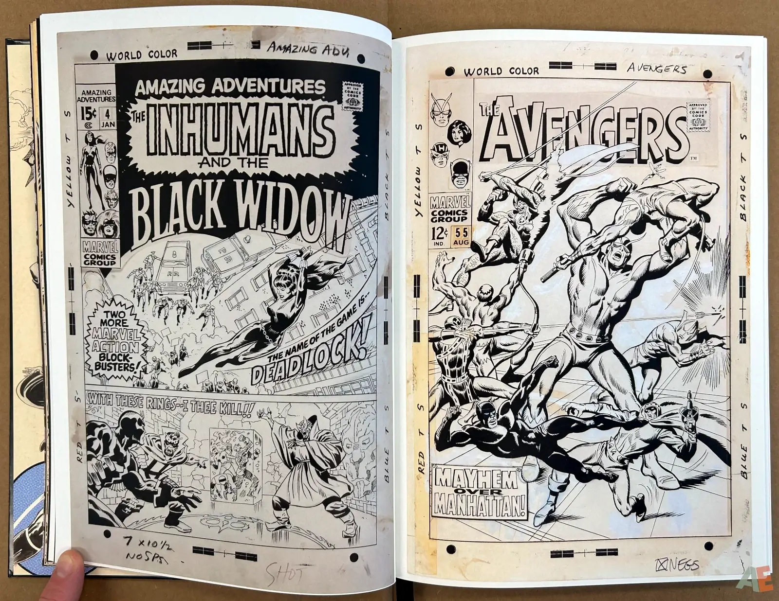
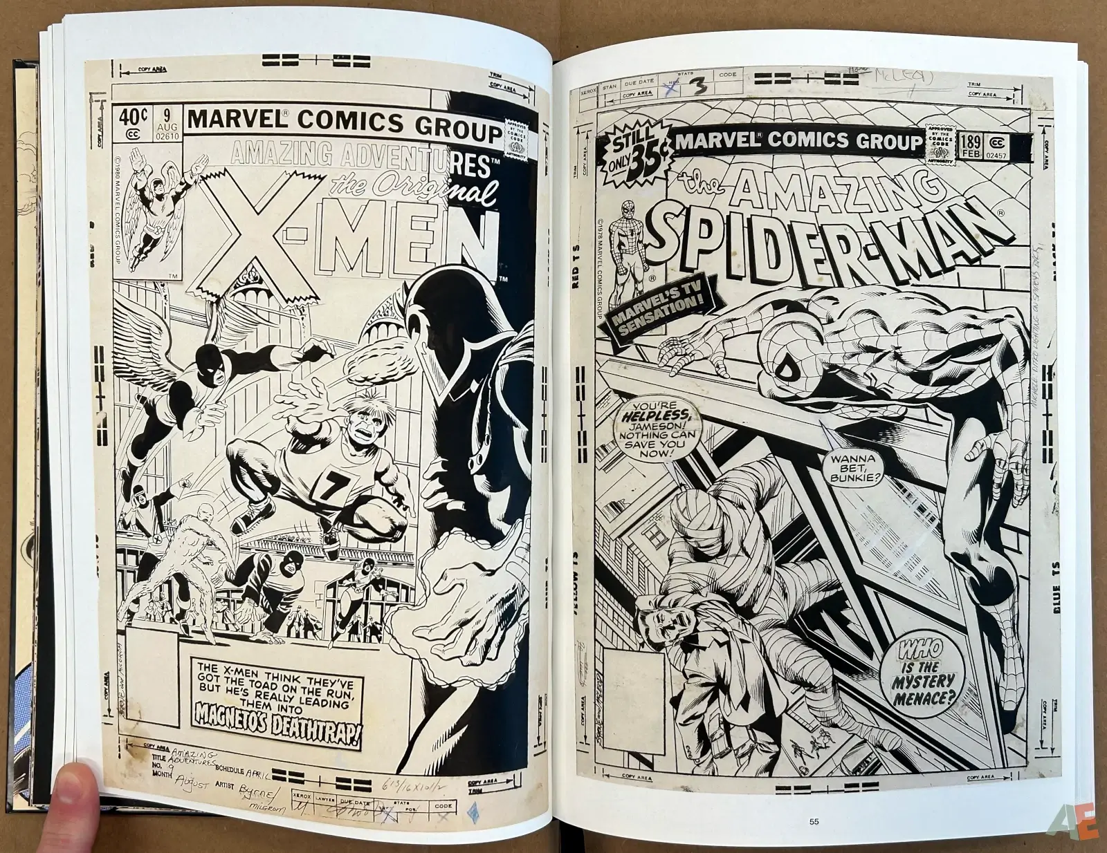
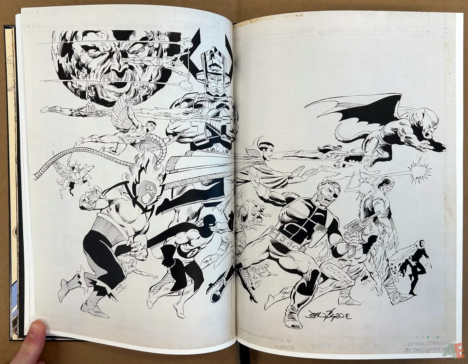
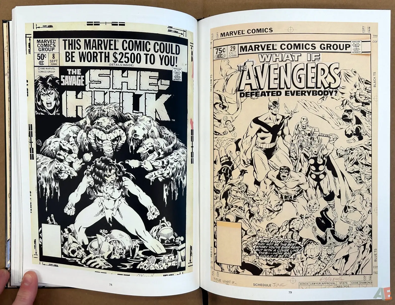
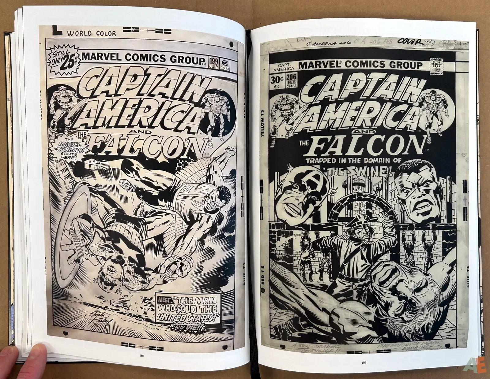
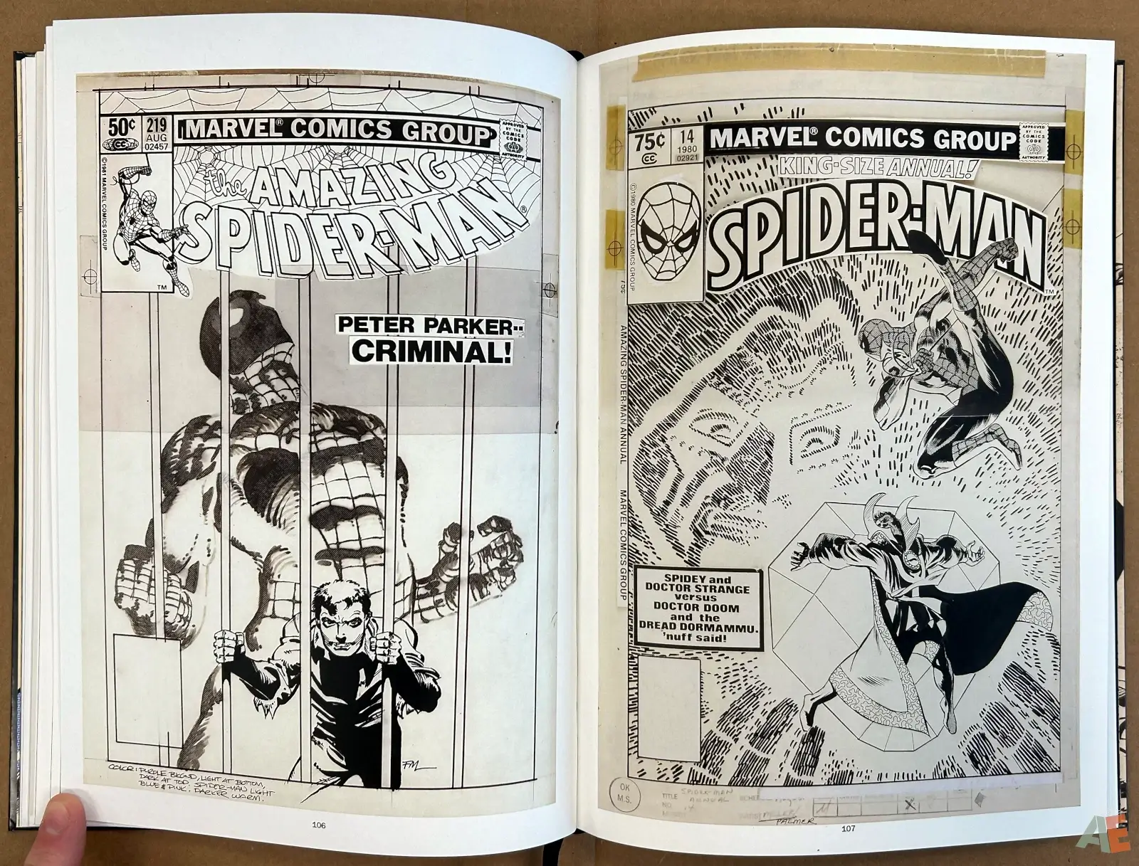
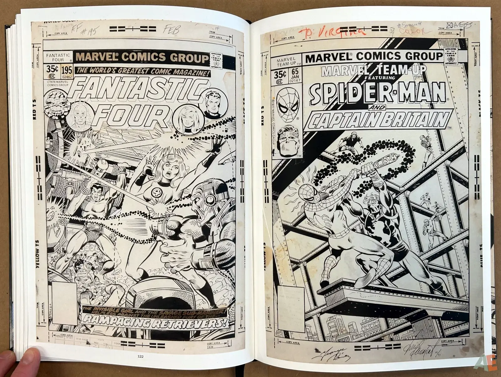
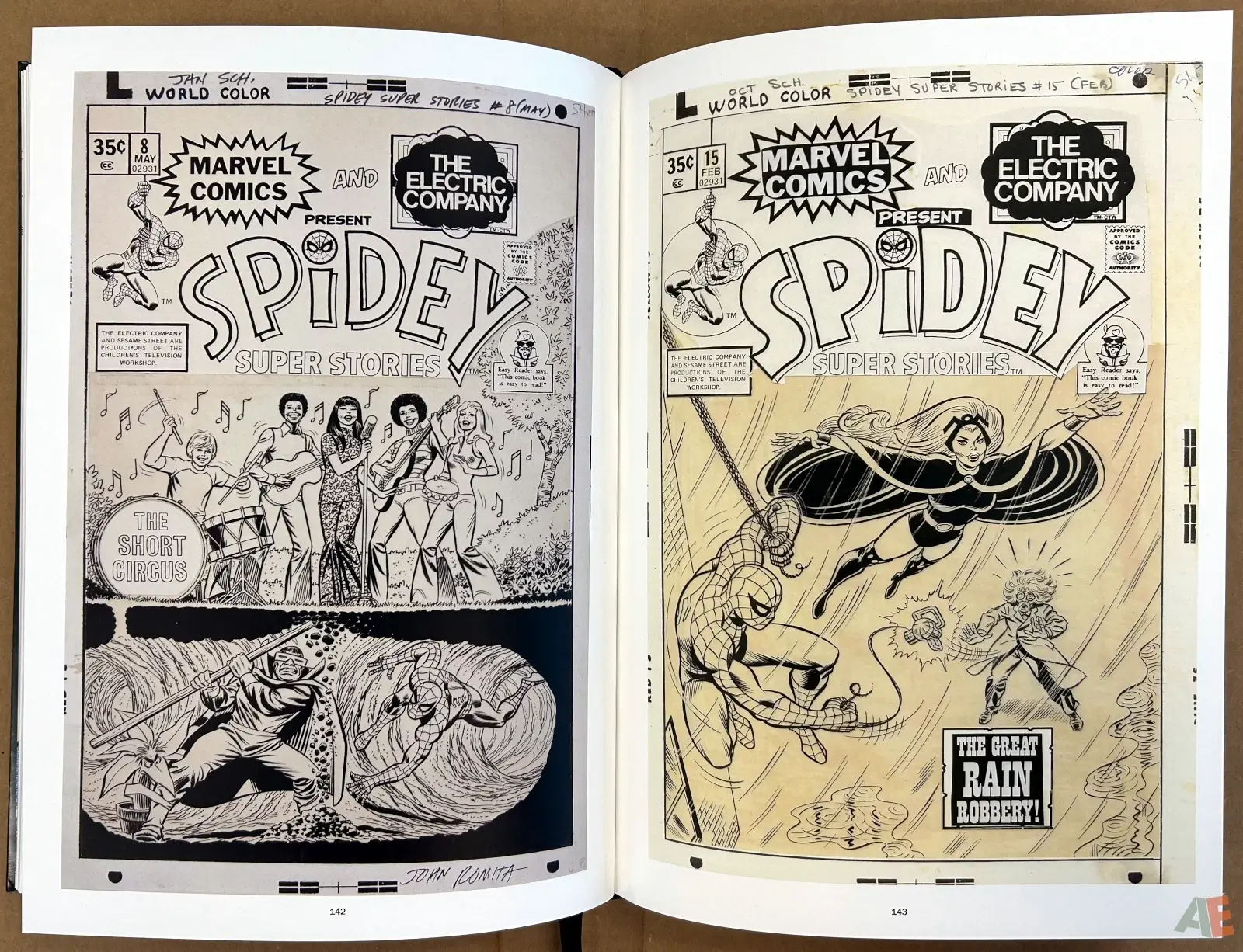
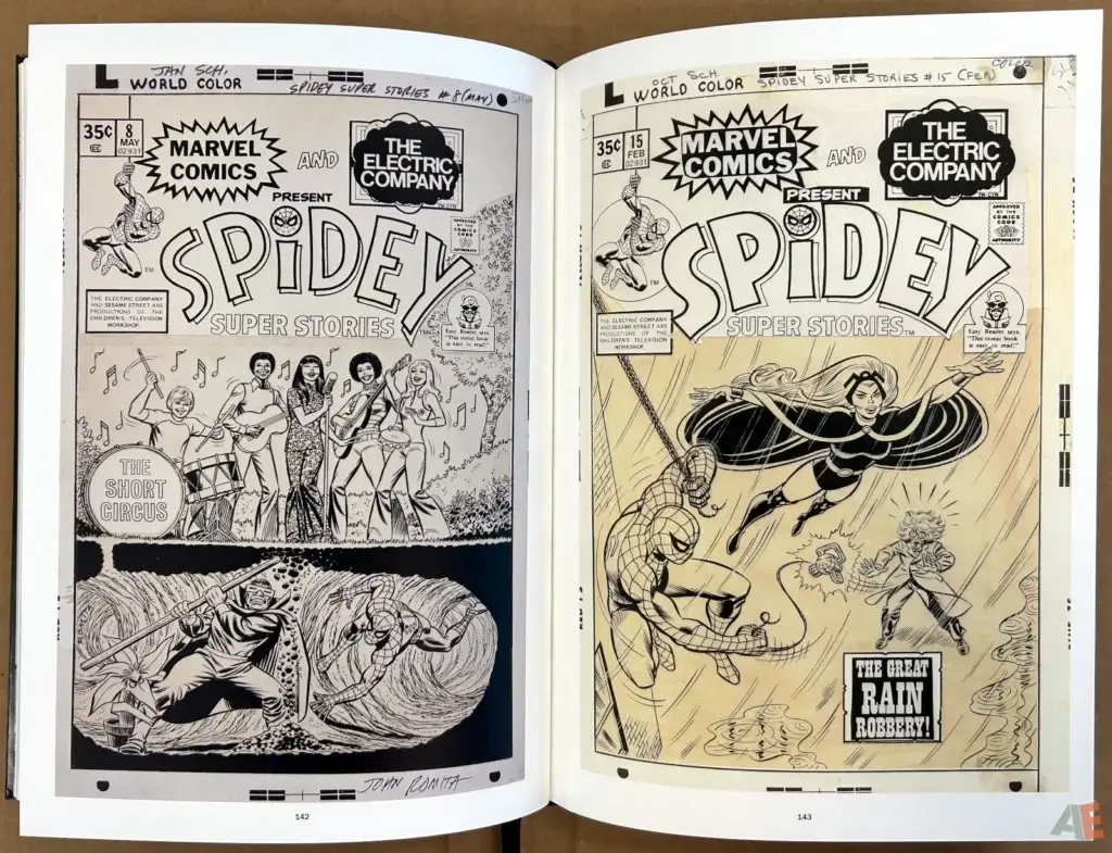
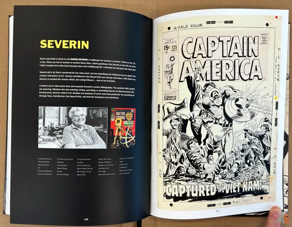
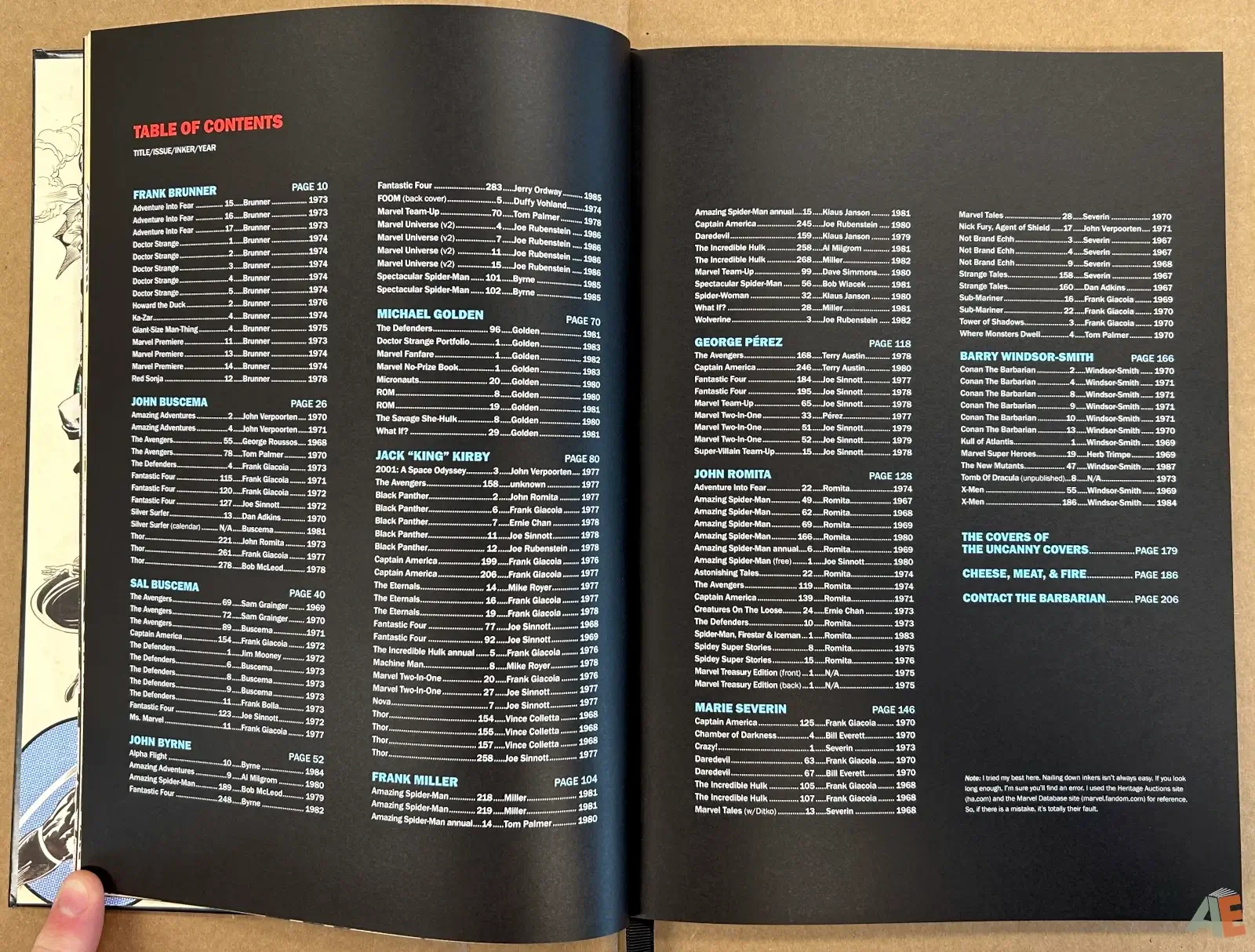
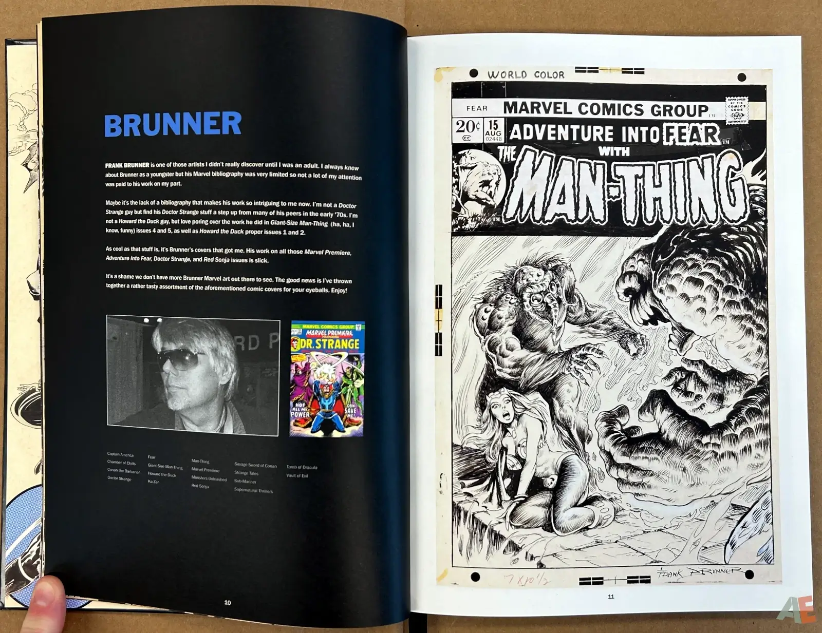
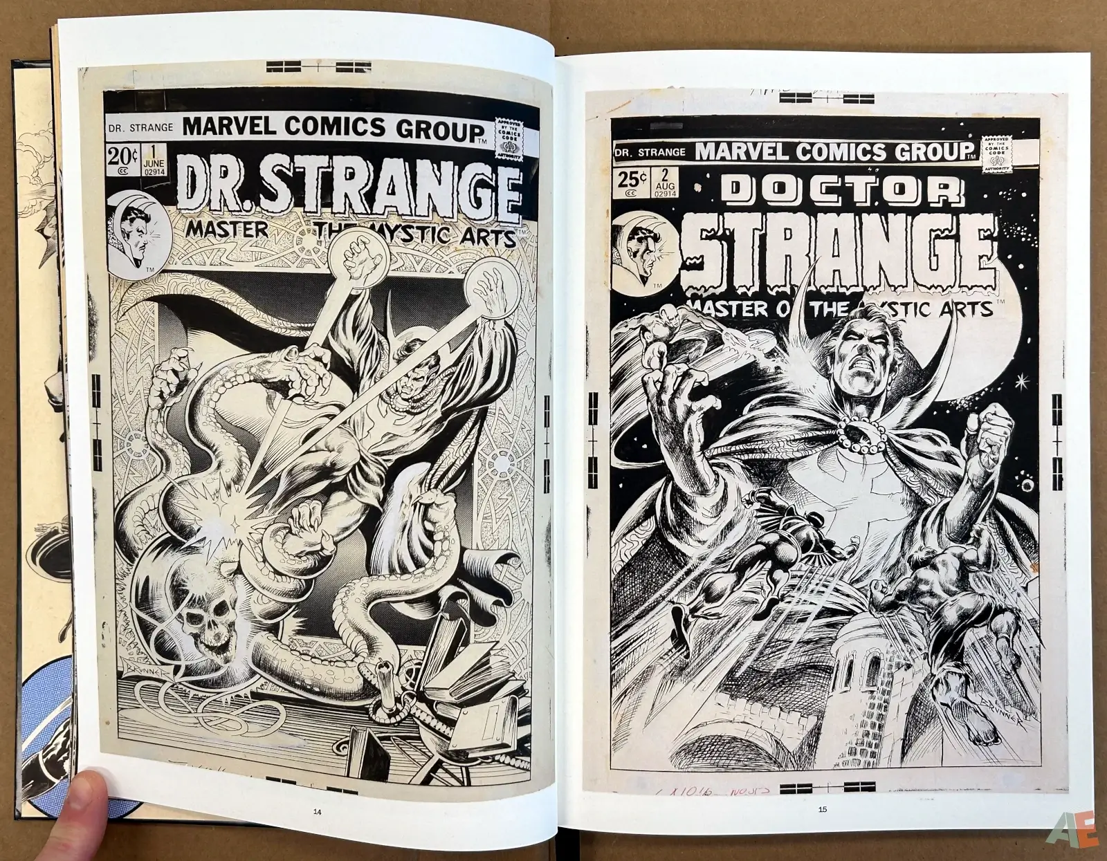
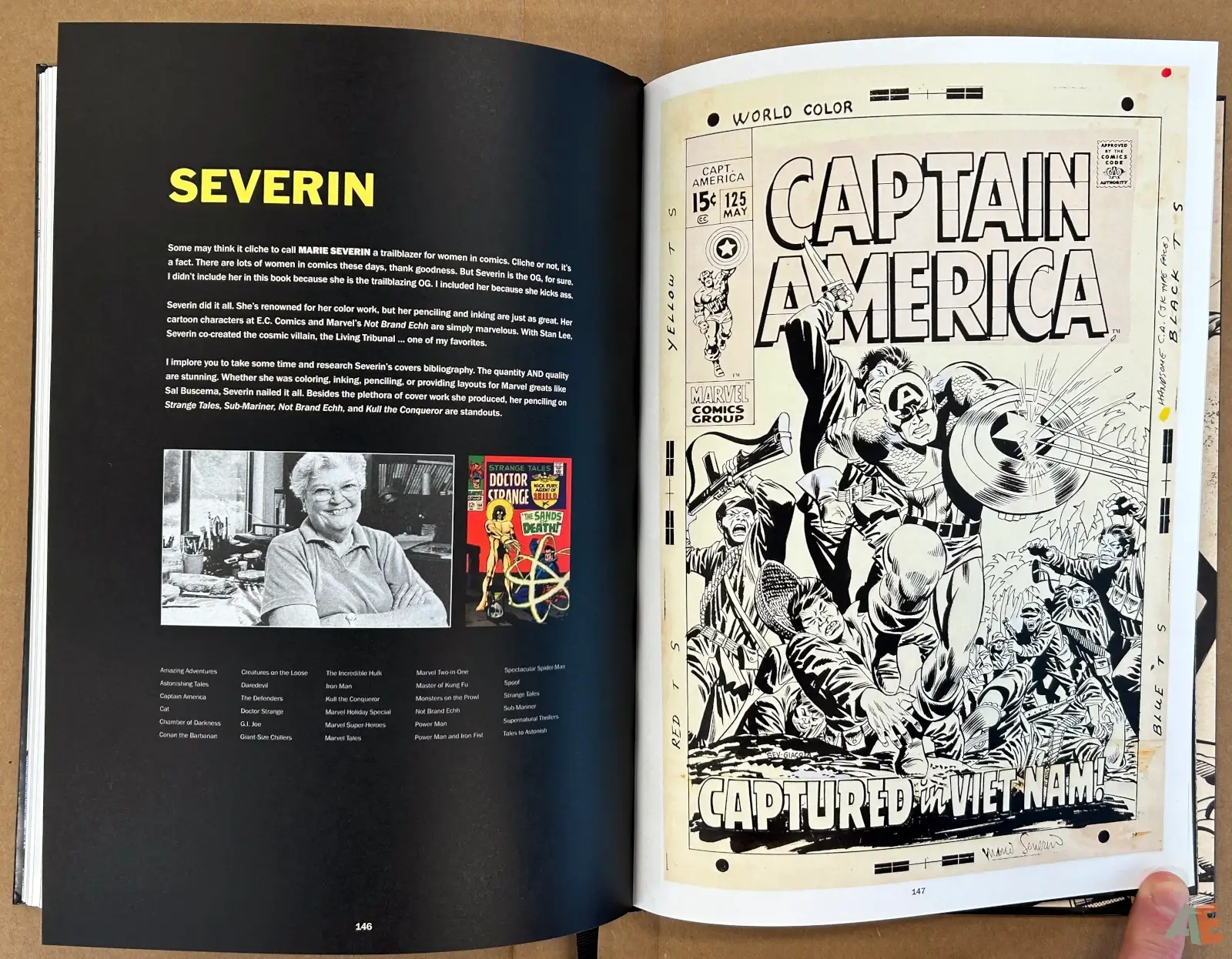
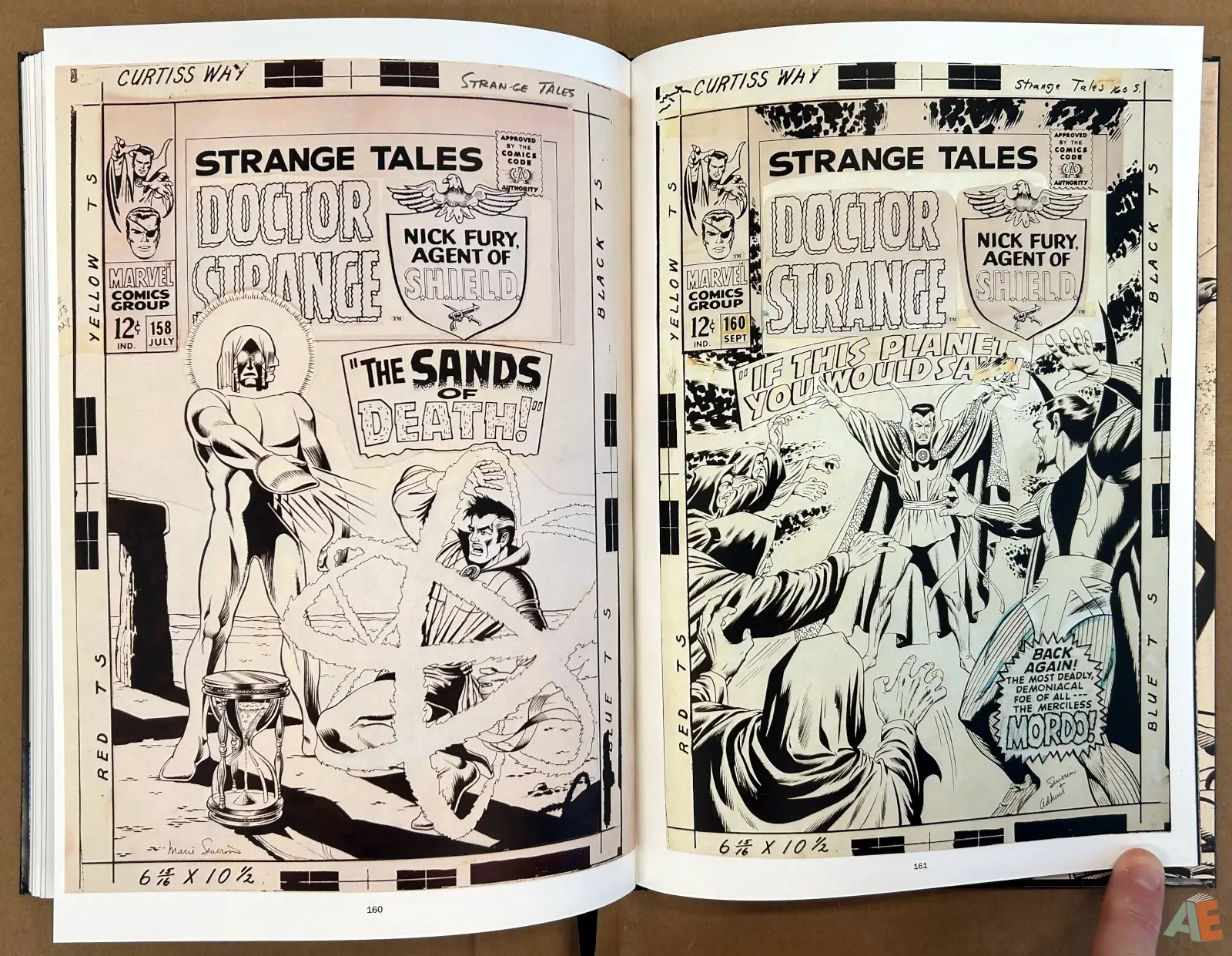
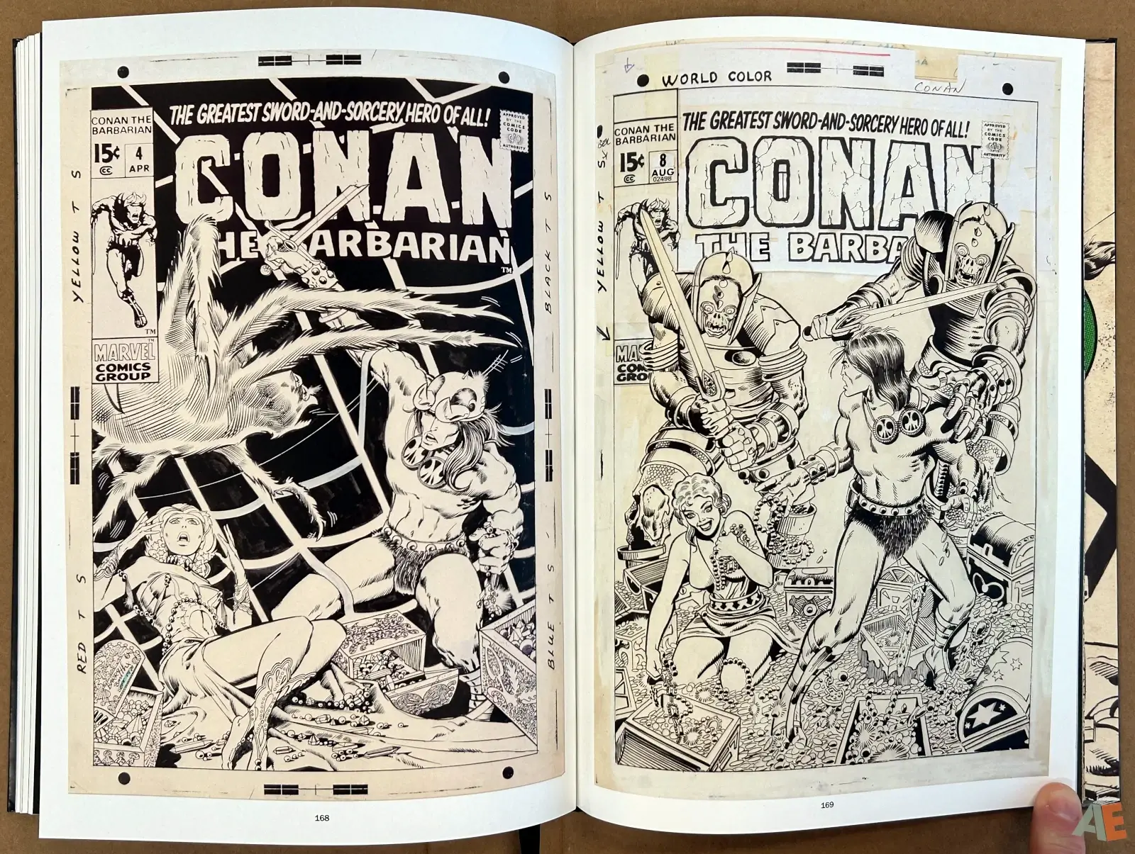
This was designed as an advertisement of Chalgren’s design chops, and it screams attention to detail. First, page numbers add a small but important detail. The table of contents includes title, inker, issue number and publication year: all the information you could want for a given piece of artwork. The black pages really stand out amongst the original art, and the rotating colours for each title is a nice touch. The font choice is great, with clear readability. The page number font doesn’t quite fit the artwork. An information page for each artist, with their photo, makes a clean break and a point of interest before moving onto the art. The double page enlargements at the front and back of the book are wonderful, and the recolouring choices work well. Every volume is numbered: it doesn’t matter how many in the print run, when you number it the owner feels like they have an exclusive item. It’s a well thought out and executed design.
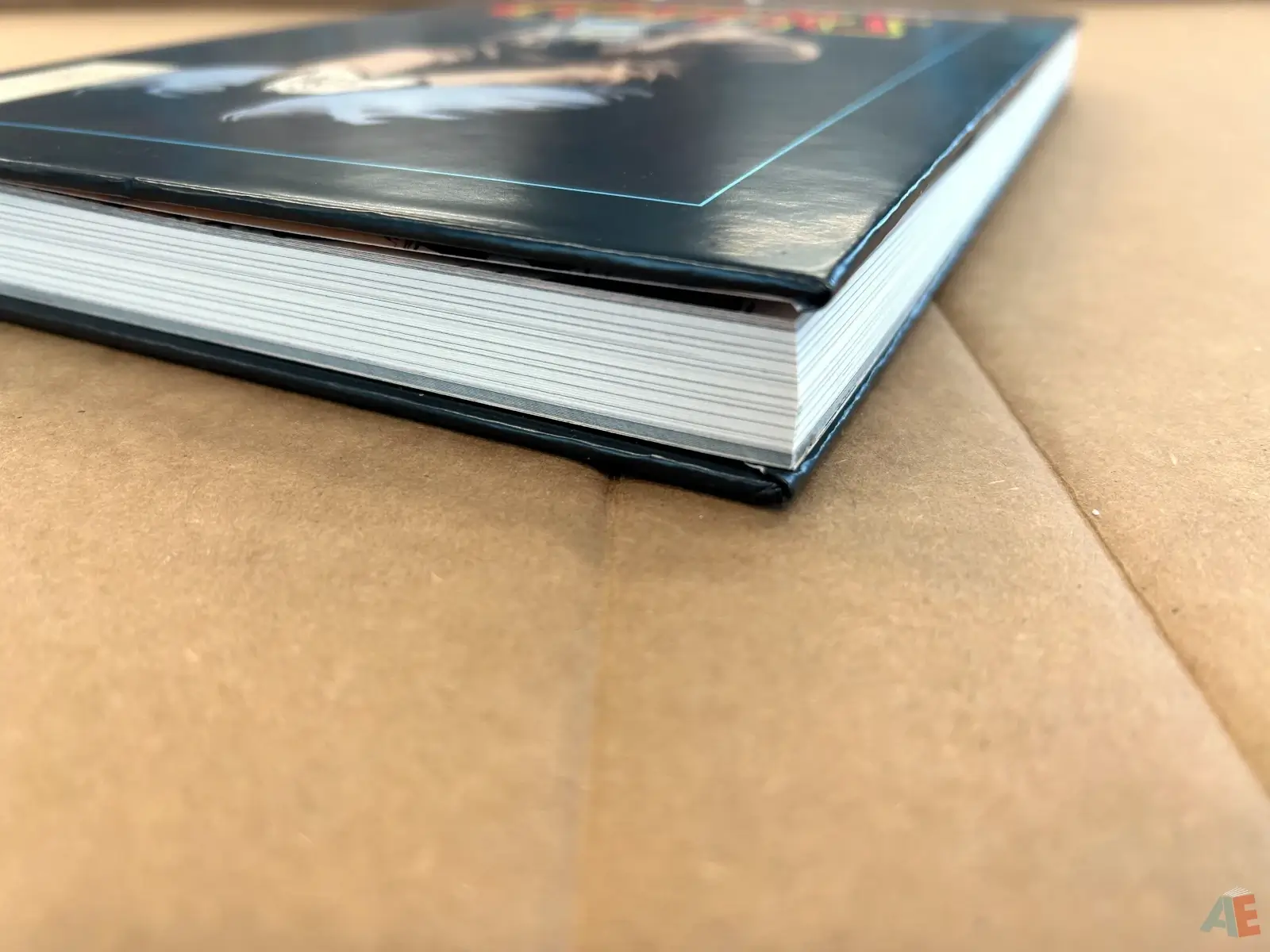
Production is a mixed bag. The paper stock shows well, as does the mix of paper. Based on how well the black showed on the matte pages, I’m not sure what the glossy paper added. The sewn binding works well, and the ribbon is always a winning choice. I found the binding very tight, and a lot of loosening didn’t get much. The cover doesn’t fit quite right, as seem in the second to last photo. And the cover material is a bit odd at the spine.
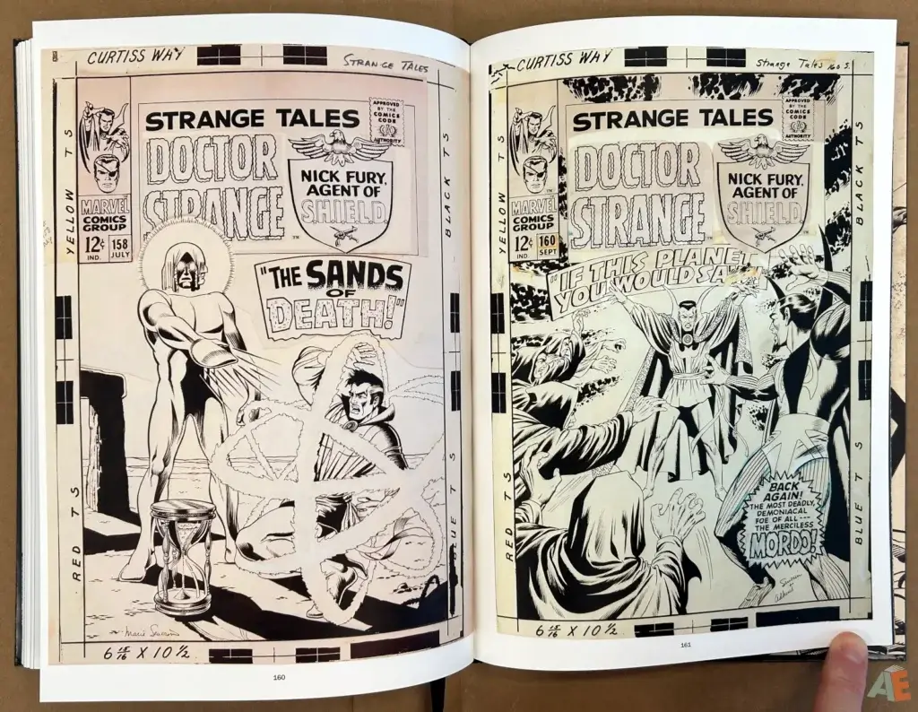
I left the scan quality to last, as this factor separates a professionally published book with access to original art to a personal project with access to internet scans. There is no comparison. At this reduced size some pages show well while others don’t.

Ian was kind enough to answer my questions regarding the processes and production of this book.
(Scott VanderPloeg) Were there minimum resolution or DPI requirements when you were gathering the images?
(Ian Chalgren) Almost all the images I procured were from the Heritage Auctions site. Most of the files on their site are just big enough to work in print at the size of my book. I certainly wouldn’t try to blow them up to the size of a typical IDW AE. I did some research on best practices for blowing up images and found a fairly simple and seemingly trustworthy method in Photoshop. Some of the files I got from Heritage were not as high res. That is when I had to make the choice of omitting that file/cover because it would not print as nice, or if the cover was important enough, try my best to upsample it in Photoshop and cross my fingers. If you look through the book, you’ll notice a few scans that just aren’t quite as sharp. Those are covers that I just really wanted to include.
(SV) How much time did it take to gather the images and then put the book together?
(IC) This book was a multi-year project. I worked on it when I had time. It certainly picked up steam when I was getting closer to finishing it. It’s hard to guess at an actual number of hours. I can say that the research (finding high quality scans) and writing took just as much time as designing the book and getting it prepped for print. I enjoyed both phases of the process.
(SV) How did you find the process?
(IC) I’ve got decades of print design experience so throwing the book together was pretty easy for me. It just took a lot of time. But I certainly learned a lot along the way.
(SV) What was the process? (Ian provided a detailed account of his process, but I’m only including part)
Knowing the book I’d be creating was based on 60’s through 80’s cover art, I spent time browsing actual comics from that time period looking for relevant (and nostalgic) design ideas. This worked out well as the design for the endpapers was based on an ad for wall stickers from a 1975 issue of Fantastic Four.
Photographed interesting pages of my own AE books and save screenshots of online photos to create a resource library (morgue file) to refer to throughout process.
Kept a file of notes containing different thoughts about what I was seeing in these books (e.g. common design denominators, and unique design ideas), as well as new ideas I come up with.
Began scouring web for original art pages that meet my criteria. While there are tons of original art pages out there, each page I’d right-click would have to meet the criteria of: 1) it had to be an artist in my top 20, 2) the file had to be somewhat better than web resolution (this was extremely limiting), 3) there could be no watermarks on the image, and 4) it could not be art IDW had used in either of their previous two covers books, and 5) it had to be cool.
Researched the inker for each selected cover as well as the year it was published. I find this info interesting and figured anyone who spends $150 on one of these books is the type of person who would also find that info interesting.
Began importing/placing the selected cover art through entire book. Basically, set up the insides before I worked on the design of cover, endpapers, title page, etc. I did this because this gave my brain/eyes another chance to look at every single cover again, which could help formulate the actual design work on the pages I had to yet work on. This was a great idea because it helped me make many positive design changes before I even got started designing.
Figured out the color palette.
After inside pages had been laid out, the main cover of the book and the variant covers of the book were all designed next. Fonts created from scratch where needed to match design/theme/nostalgia.
Back and forth from Photoshop to Illustrator to polish up cover(s) of book as needed.
Endpapers were designed next. This was a time-sucker because of all the images used on the endpaper designs. LOTS of Photoshop masking to make this section successful. Title page, Credits page, About page were designed next. Sectional pages designed.
Table of contents designed, double-checked, re-checked, and double-re-checked. The goal of the table of contents is legibility so I opted for no artwork on these pages. Nice break for the eye, too.
(SV) Where did you get it printed?
(IC) Marathon Press in Norfolk, Nebraska USA. This printer was suggested to me by a fella named David Banks. David is a master re-colorist and restoration wizard. Some of his latest work was on this book: Mighty Marvel Calendar Book: A Visual History.
(SV) You printed in North America: did you look at Asian or European printers?
(IC) At no time did I consider a printer outside of the United States. Most books these days seem to be printed outside the US, and I believe that is simply because of costs. I’ve chatted with some of my local, high-end printers about printing a full size AE and they said they could do it, but it would cost a ton.
(SV) How was the cost, and did it drop if you increased copies?
(IC) Yes, the cost certainly went down price-per-book the more I ordered. The fact that the printer was in Nebraska rather than LA or NYC helped keep costs down, too. I did get an estimate from a printer in NY and it was almost double of Marathon Press in Nebraska. A few bells and whistles that increased the cost were: printed endpapers, five different covers, two different interior papers, inclusion of a bookmark ribbon, and inclusion of the top and bottom spine ribbons. I wasn’t interested in going cheap on this book because I wanted as much wow/cool factor as possible. Total cost to print 50 books was around $3k.
(SV) Were you given many choices from the printer on how the book would be completed, i.e. binding, paper type and weight, cover, etc.?
(IC) I had a great partner at Marathon Press. His name is Martin Pugh. Martin and I had many phone conversations about the book before he ever saw files. I explained my goals for the book and he offered suggestions that would help keep the cost down while still achieving the quality I wanted. For example: I had a specific paper in mind and Martin mentioned that he had a very similar house paper in stock. He talked me through their binding process, too. They are a strictly digital printing shop so lots of the details were pretty straight-forward. I also signed on for a set of physical proofs to be mailed to me. The proofs came on the actual paper(s) we were planning on using, which was great. Having the proofs created added a nice chunk of cost to the final bill but it was totally worth it. Because of the proofs, I had to make some serious tweaks to the colors of the covers. Getting physical proofs is an absolute must, in my opinion.
(SV) I found the page size to be very close to the cover size, which is not generally something we see with commercially available books: were you aware of that from the printer?
(IC) Ah, yeah. Ya know, it varies. Some books are better than others. These books were hand-assembled. When I have all 5 of them up on a shelf, the spines are not all dead on. I guess what I’m trying to say is that even though the quality of the books is decent, it’s not that decent. In no way were these books ever to come close to the quality of an IDW AE. I couldn’t have afforded that financially.
(SV) Because of the trademarks you can’t sell this commercially, but would you be interested in doing something like this again with public domain images?
(IC) This is something I’ve been thinking about quite a bit. I need to find something that I actually like though. I haven’t done much research but this idea is certainly on my radar. I do have ideas for my next couple Ocular Editions. Unfortunately, these ideas again fall into the realm of using copyrighted material I don’t own but my goal is still the same … not to sell the book, but to “wow” some folks and get “real” jobs. I don’t want to spill the beans on my next Ocular Edition (only because I don’t want someone else to use the idea before I do!) but will say that the book will be focused on DC art, and it won’t be original art.

